Hello, book marketeers! Can I call you that? I thought it was better than ‘subscribers’, so I’m going for something a bit more specific, and empowering, and fun!
Anyway …
Following on from last edition’s article on author branding (you can access this via the archives), today we are looking closely at the visuals. That is, the graphic elements that create a first impression of YOU – the clever you, the romantic you, the serious you, the wacky and quirky you – whatever YOU are.
Be consistent.
Try to stick to similar visual elements across your website and social media channels that represent your style. A great place to start is to look at your book covers, and if you don’t have any yet, explore the elements that you connect with the most.
These include …
- Font style/s
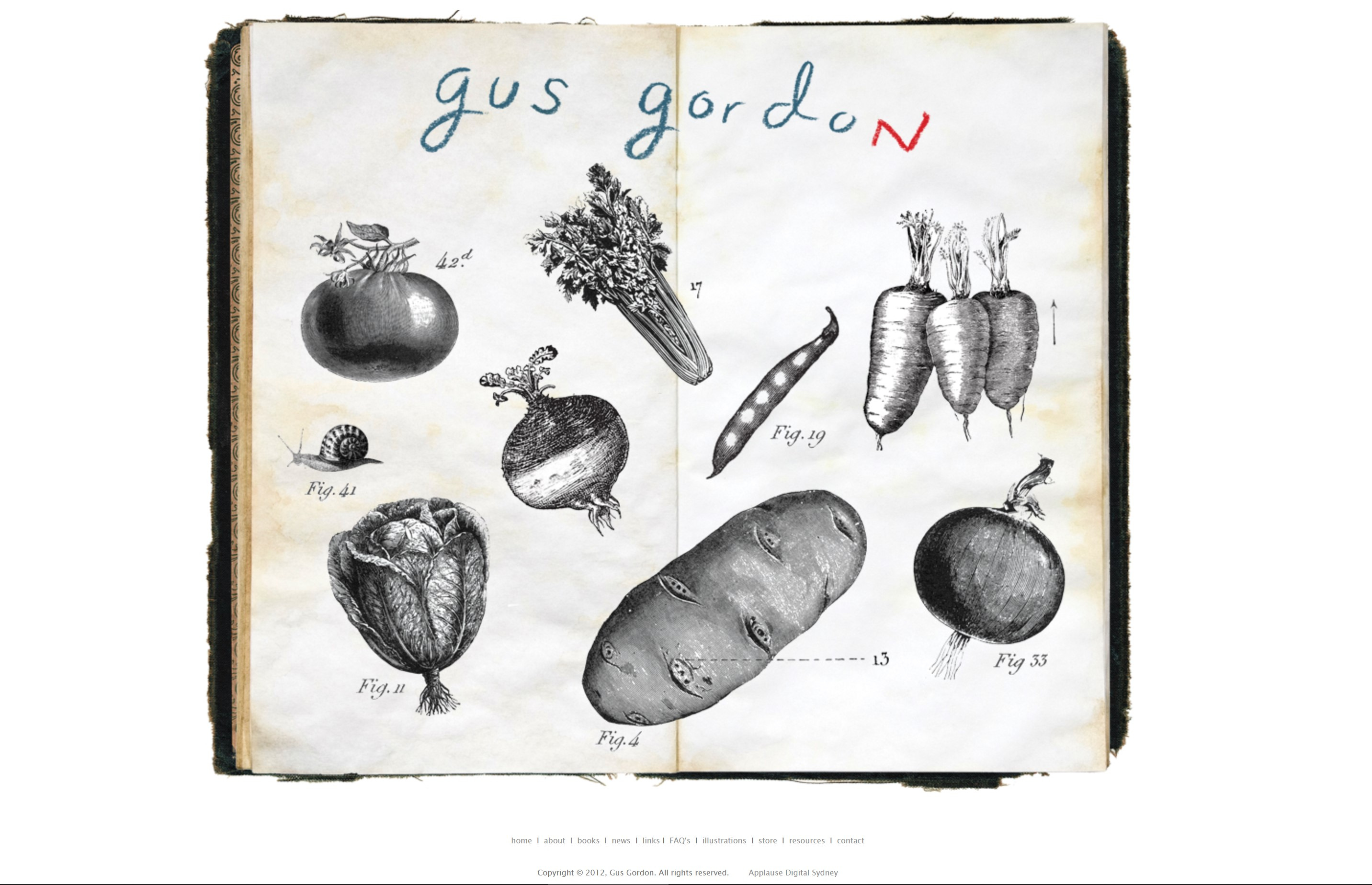
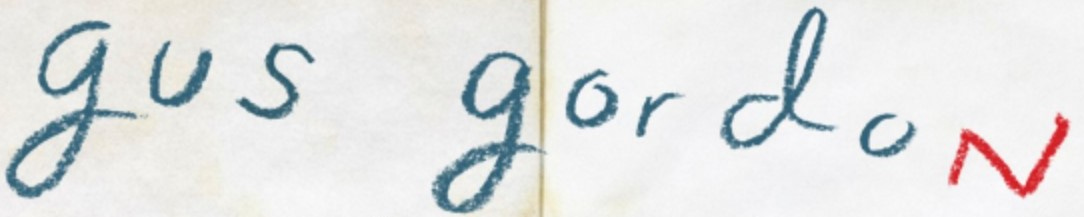
Remember YOU – your style. Fonts say so much about a style. Select a font or fonts that will be consistent across your website, socials, on graphics, and even your email signature. I mean, if there’s someone who knows how to be easily recognisable, it’s Gus Gordon – don’t you think?
A couple of websites you can find and download a huge collection of fonts are dafont.com and fontsquirrel.com.
TIP: Make sure your font/s are (very) readable! No fancy shmancy. Obvious, I know!
- Colours
Easy on the eyes! No, really. Colour psychology is real, people. How your colours make people feel will have an impact on their reading / buying / browsing choices. True fact.
So, here are the tips:
1. Pick a primary colour that suits the mood and energy of your style.
2. Then, pick an additional one or two complementary colours that make your primary colour pop.
3. Pick a background colour that is unoffensive and uncluttered. Generally, a muted tone of your primary colour or white/off-white are common choices.
4. Font colour. Don’t let them click away! Stark contrast, like darkest black on white can cause eye strain, so often a softer grey is used instead. Alternatively, test out font colours over background colours to see what pops best!
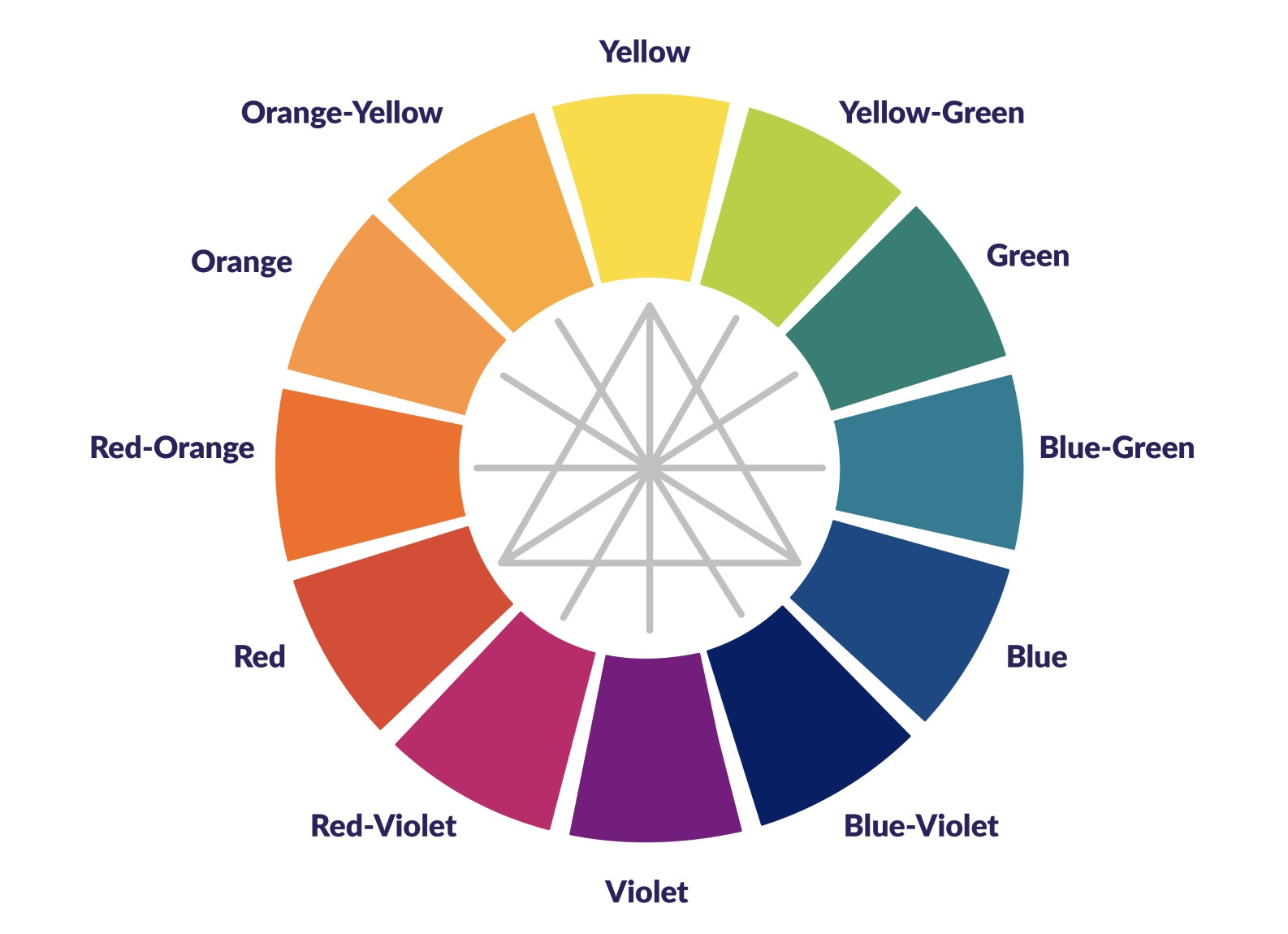
Here you go … a colour wheel. Colours opposite each other are complementary, and the primary colours are on the triangle points.
TIP: Keep note of your exact colours or hex # (check out color-hex.com)
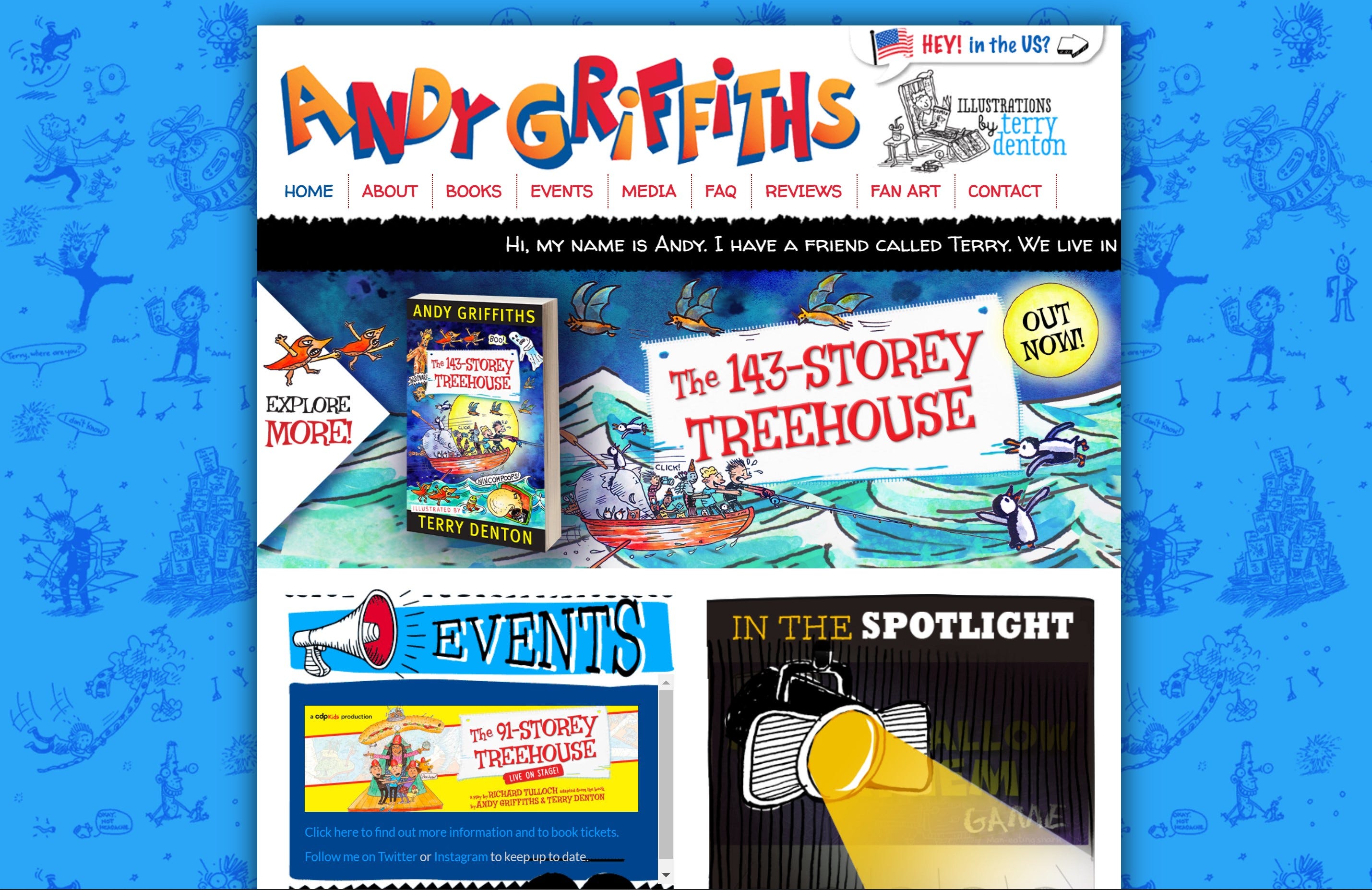
And if you want to see a website that really tests out your eyeballs, which is so Andy Griffiths, check out the website of none other than … Andy Griffiths! It works!
Ready to join?
- Illustration style/s
If you’re an illustrator, you’ve got this in the bag! Authors, there’s no hope … just kidding! Of course, you can have an illustration style, too! No doubt you’ve already very kindly asked one of your illustrators (and publisher) to use images (other than just the front cover) from your books on your website and socials. Place characters in strategic positions. Show full page spreads in a sliding banner, or even your background. Pop little visual elements in or around your brand name / header. Remember, these should be fairly consistent across your platforms and represent YOU.
And if you’re just starting out, add your own personal touches with photos, images or your own drawings that show your audience what you represent.
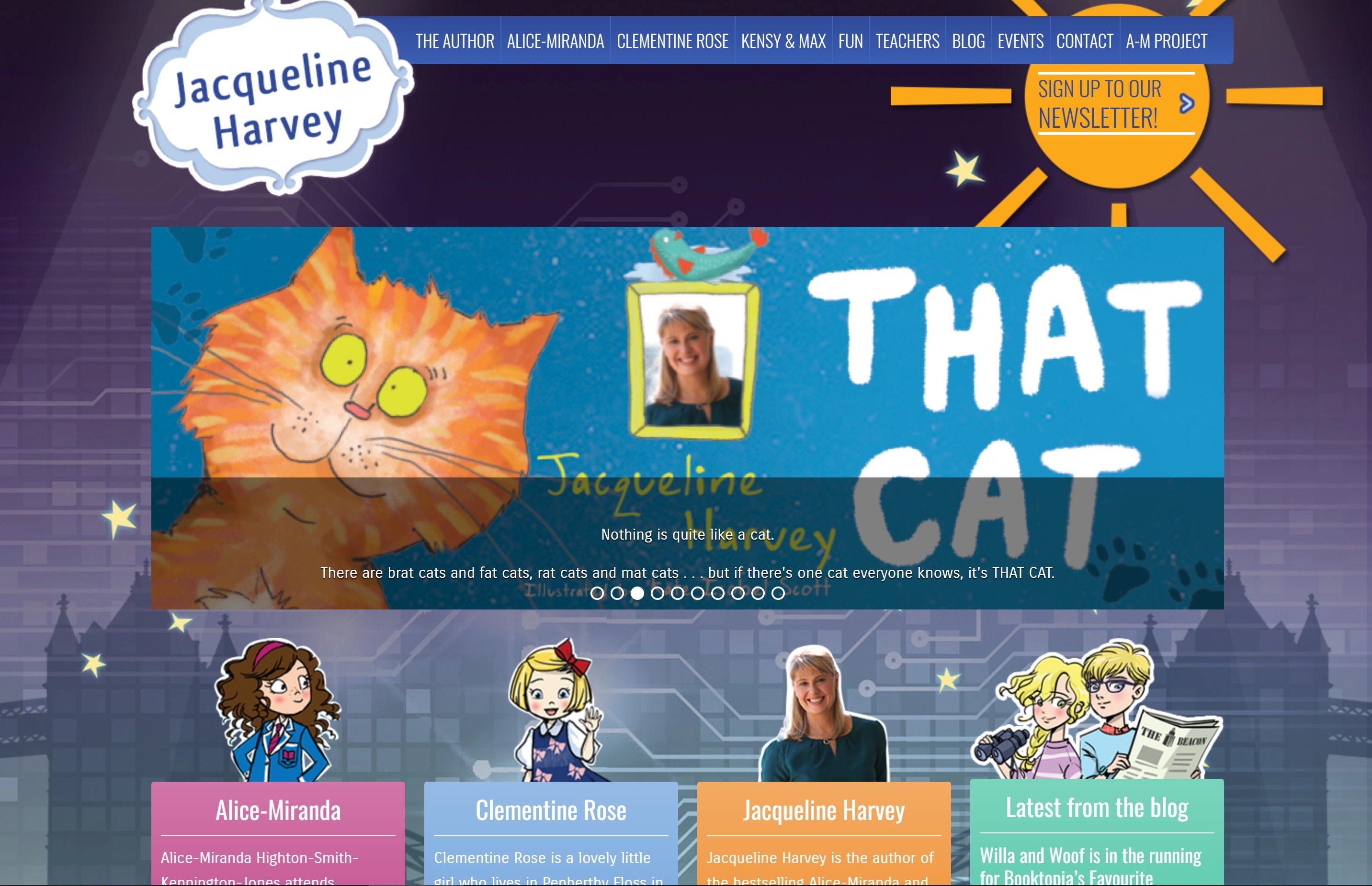
Check out the fabulous website of Jacqueline Harvey and her gorgeous characters that each have their own place on the site.
- Other visual elements
Refer back to all of the above examples for the hidden, and not-so-hidden visual elements that are consistent with each of the author brands. Here are two more things to consider …
1. A logo. Hello,
Your name, a symbol, an illustration. This is your brand’s identification. Do you have a logo?
2. A profile photo. Yes, we want to see YOU! Headshots are a must for all your publicity and are most certainly a visual element that identifies YOU. Again, obviously!
And finally, a quick game: How many can you spot?
1. Spot the graphic element on the website that is consistently used in Jacqueline Harvey’s Clementine Rose books.
2. Spot the visual ‘hook’ on Andy Griffiths’ website to keep you reading.
3. Spot a colour element consistent across the pages of Gus Gordon’s website.
In summary …
Honing in on what makes YOU, you, will help you identify the perfect choices for your fonts, colours and visual or illustrative elements.